Jane Austen’s novels predated the great flowering of the illustrated novel of Victorian times, when the reading public came to expect their fiction to come with pictures. The novels of Dickens, Thackeray, Trollope, George Eliot, and others regularly (though not always) came with illustrations. Thackeray famously illustrated his own novels, and the simultaneous frown and smile of his wickedly attractive Becky Sharp of Vanity Fair are her signature. Graphic artists like Cruikshank, Charles Leech, and Hablot K. Browne were much called upon. Sometimes big-name artists, such as John Everett Millais and Frederic Leighton, both Royal Academicians, were called into service too.1 John Tenniel’s illustrations to Lewis Carroll’s Alice in Wonderland have become iconic.
You might say that Dickens wrote to be illustrated. He gives us facial expressions, hair-cuts, attitudes, actions, mannerisms. Who can forget Mr. Pickwick, with his round face and tight gaiters?—or slimy ’umble Uriah Heep of David Copperfield, or the villainous Rigaud of Little Dorrit, with his signature smile? “His moustache went up under his nose, and his nose came down over his moustache, in a very sinister and cruel manner” (Little Dorrit 6). Villainous but appealing Fagin of Oliver Twist may appear in Cruikshank’s illustration, on Christmas wrapping paper, or a Toby jug, or a clay figurine, but he is still identifiable. It was the nature of Dickens’s visionary inspiration, he said, not so much to invent the content of his fiction, but to “see it, and write it down” (Forster 720). No wonder he could supply all those details of appearance.
These pictorial extensions to fiction were yet to come when Jane Austen published her novels, which weren’t illustrated in her own day. When Hugh Thomson and the Brock brothers swung into action, nearly a century later, they were trying to catch up with a fashion that was already fading. I don’t know how satisfying you find their elegant, well-researched costume pieces. For me they recall Charlotte Brontë’s famously dismissive dictum on Austen: “She does her business of delineating the surface of the lives of genteel English people curiously well” (128). That doesn’t begin to describe Austen’s novels, which are so much more than surface, but it’s not far from those elegant but relatively empty illustrations. (But then who could satisfactorily illustrate Austen’s novels? I wouldn’t dare to try.)
For, unlike Dickens, the mature Austen doesn’t provide us with much information about appearances. We know, for instance, that Bingley considers Jane Bennet “‘the most beautiful creature [he] ever beheld’” (PP 11), but we don’t know if she is dark or fair, tall or short. We know that Emma has “‘the true hazle eye’” and dark hair and that Mr. Knightley “‘love[s] to look at her’” (E 39). But we get little further detail about her looks, or other characters’ either—though we do hear a lot about looking. Austen’s mode is dramatic rather than pictorial, and we can see why she adapts so well to the screen. If you are creating a role to be acted, you can’t get too specific about short and tall, fat and thin, lest no actor in the company will qualify.
What does Mr. Darcy look like? Do I hear you say, “Colin Firth”? I rest my case!
Nor do we hear much of vigorous action or rowdy behavior: Louisa’s fall from the Cobb is about as violent as things get in the novels, Mr. Elton’s inebriated proposal to Emma about as indecorous. Not a lot of scope for an illustrator with satiric propensities.
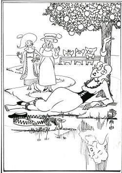
But the juvenilia are another matter! Plenty of action and bad behavior there! In Jack & Alice alone, we have the whole company at a masquerade boozing until they are “Dead Drunk” (7),2 a poisoning, a villainess “speedily raised to the Gallows” (26), and a lady’s leg broken “‘in one of the steel traps so common in gentlemen’s grounds’” (17). The mature Austen advised her novelist niece against supplying “too many particulars of right hand & left” in her descriptions of scenery (9–18 September 1814). But here we even get details of landscape that I could include in my illustrated Jack & Alice. Lady Williams takes Alice for a walk in a Citron grove “from her Ladyship’s pigstye to Charles Adams’s Horsepond” (12). Please note the pigstye back there and the citrus tree and horse-pond in the foreground.
As in Dickens, there’s a lot about food and drink. In the novels, we don’t get much about what is eaten in those many dinners and other social occasions, far less about the consumers’ enjoyment. No such cheerful gourmandizing as in Pickwick Papers. Catherine Morland has “to eat without being hungry” (NA 156). Emma is something of an exception, in that food is often mentioned, but it’s largely in the context of Mr. Woodhouse’s dietary restrictions: sweetbreads and asparagus and wedding cake are luxurious items he denies to other people! In the juvenilia, however, we hear of “Whipt syllabub,” “roasted Beef, Broiled Mutton” (Lesley Castle 7, 6), gooseberry wine, warmed ale and nutmeg, “fried Cowheel & Onion,” “Liver & Crow,” and “suet pudding” (“The Visit,” Three Mini-Dramas 7–9). These are things an illustrator can get her teeth into!
Moreover, in the juvenilia personal appearance matters! And we get detail. Remember Rebecca in Frederic and Elfrida, the very first narrative in Volume the First? Three friends, Elfrida, Frederic, and Charlotte, go to pay a formal visit on a family just arrived in the neighborhood.
[E]’re they had been many minutes seated, the Wit & Charms which shone resplendent in the conversation of the amiable Rebecca, enchanted them so much that they all with one accord jumped up & exclaimed.
“Lovely & too charming Fair one, notwithstanding your forbidding Squint, your greazy tresses & your swelling Back, which are more frightfull than imagination can paint or pen describe, I cannot refrain from expressing my raptures, at the engaging Qualities of your Mind.” (5–7).
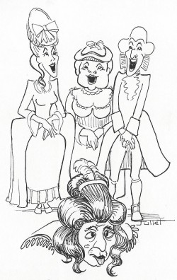
How’s that for physical detail! An illustrator can hardly complain of lack of guidance. The outrageous personal insults are delivered in the guise of a compliment to Rebecca’s mind—so I showed my speakers smiling, and in chorus—and in attitudes of recitation, hands folded, eyes turned up. Not surprisingly, poor Rebecca, with her squint and her greasy tresses, is “abashed.” Later we hear that she takes to “Patches, Powder, Pomatum & Paint” to remedy the situation (8).
Non-Janeites have traditionally sneered at Austen’s novels for being prissy and prim, presenting only tea-parties and elegant balls where, above all, propriety pertains. Such people need a dose of the juvenilia, where young Jane actually specializes in kicking over the traces, especially on formal occasions.
Facial color matters too, and we hear a lot about it, from the characters, if not from the narrator. Take the important issue of Alice Johnson’s complexion. Lady Williams tells of a certain hostess:
“Mrs Watkins . . . was in general esteemed a pretty Woman, but I never thought her very handsome, for my part. She had too high a forehead, Her eyes were too small & she had too much colour.”
“How can that be?” interrupted Miss Johnson reddening with anger; [You will remember that Alice is inclined to hit the bottle.] Do you think that any one can have too much colour?”
“Indeed I do, & I’ll tell you why I do my dear Alice; when a person has too great a degree of red in their Complexion, it gives their face in my opinion, too red a look.” . . .
“Pray Ma’am proceed in your story.” (Jack & Alice 11)
Lady Williams does proceed, and she gets to Mrs. Watkins’s red face again, and the argument goes as before, like a broken record repeating itself. The passage is outrageous and absurd, but for an illustrator it represents opportunity. ![]()
And here I pause briefly, to explain how I came to be an illustrator. Literature has been and remains my profession and my first love. But my mother came from a family of artists, and she brought her children up to practice art to the extent of our ability. At school literature and art were my two great loves. I was keen to go to Oxford, but getting there was tough, especially, in those days, for women. I told myself that if I got into Oxford, I’d do English; otherwise, I’d go to art school.
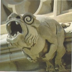
Well, I did get into Oxford, so literature became my profession, and a wonderfully rewarding one it has been. But art remained a hobby, something I could always do for pleasure. Between my academic studies I snatched stints at art school, specializing in sculpture. As a graduate student at Mt. Holyoke College I learned that officials at Washington Cathedral, then a-building, were ready to consider designs for gargoyles by the general public. I busily created my gargoyle according to specifications, and, hooray, in due course it was accepted and carved by the cathedral masons. My gargoyle—“Belly-ache,” they named him, since he is clutching his belly—will no doubt outlast all other publications of mine! With a fulltime career and kids, my artistic efforts were limited to the domestic front: giving drawing lessons, writing and illustrating home-made books for and with my kids, making ceramic figurines of literary characters, as you have seen.
Then came the time when my art hobby converged with my Jane Austen studies. At the last JASNA AGM on the juvenilia, organized by our founder Jack Grey in New York, back in 1987, I conceived the idea of turning Jane’s cheerful little story The Beautifull Cassandra, written at twelve, into a picture book for kids. Like Beatrix Potter’s Peter Rabbit, it’s a story about a day’s adventures in the life of a young person. My plan was to turn the characters into small animals and dress them in the fashions of the 1780s. Cassandra becomes a mouse, other characters include a rat, a guinea-pig, a frog, a squirrel. I particularly enjoyed the story because unlike many stories for children, especially those about girls, it isn’t didactic. Cassandra goes on a binge of pleasure, knocks back six ice-creams at a sitting, and takes a joyride to Hampstead and back. And there is no come-uppance: Cassandra is welcomed home by her devoted mother and concludes with satisfaction, “‘This is a day well spent.’”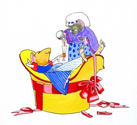
For this artistic project, I wanted to go professional and find a publisher. But even with Jane as a teammate, it took me years. I had a lot to learn about putting together a children’s picture book. How should I establish continuity from one picture to another? How suggest character and emotion through appearance?
For continuity I decided on an outward/homeward progress. As Cassandra launches on her adventures, she progresses from left to right, like the printed line. The coach heading up to Hampstead heads from the left of the page towards the right. I made the draft animal a tortoise—a fast one!—and he can be cheerfully immune from the frog coachman’s whip! At turn-around time the action moves homewards from right to left.
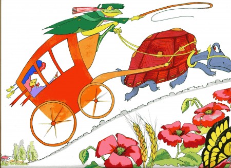
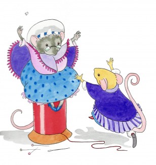
To make emotion visible, I exploited a limb not available to humans—the mouse’s tail. You will see that this tail comes in various attitudes: tensely elevated at vigorous moments; grounded and flaccid when Cassandra can’t pay the fare; hitched up over her arm as she sprints off like an athlete, once she has plonked the wrecked bonnet on the coachman’s head.
 |
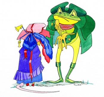 |
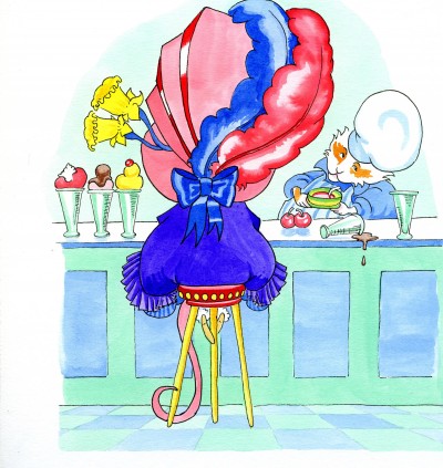
And in case you are looking for character development: please note the progress of Cassandra’s Significant Other, the bonnet. The wrecked bonnet you see above was once the pristine bonnet that appears below. It was a fancy of mine to show the bonnet partaking in Cassandra’s experience. Here you will note that the daffodils get fatter as she guzzles her six ice creams.
 The Beautifull Cassandra has done well for me, going through a couple of reprintings, and JASNA members have been highly supportive. Joanne Forman, a composer, set Cassandra to music for flute and harp, which was played live at the Chicago AGM of 2008. And that adaptation in turn inspired a ballet for children, in which I saw my Viscount and Pastry-cook characters, in recognizable outfits, dance their roles. (The music, photographs of the production, and the illustrations are available on JASNA’s website.)
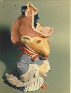
Jack Grey had been hugely supportive of my Cassandra project. He died before she was published. But I’m glad I was able to give him a ceramic figure of my Cassandra.
Alas, Cassandra’s shelf-life is over. Unfortunately the warehouse of the publisher, Sono Nis Press, burned down, along with the plates and nearly all unsold copies. I still keep the originals, though.3
I like to think that she lives on in spirit, however, because it was through working closely on this childhood work of Austen’s, as one has to if one is illustrating it, that I realized that intent study of a childhood work can give you a particular window on an author’s development. If that works for me, I thought, why not for students? That idea led me to the foundation of the Juvenilia Press: a press devoted to publishing scholarly editions of early works by known authors. And because I developed the idea as a classroom enterprise when I taught a course on Jane Austen, I decided that student participation in the editing process would continue to be a requirement for all volumes: that way the student co-editors get hands-on experience in such skills as textual editing, annotation, sometimes illustration and book design—skills not otherwise available to them. It’s an enterprise in pedagogy as well as in the recovery of youthful writings. Our first volume with the Juvenilia Press imprint came in 1994; since then the Press has published dozens of volumes, with authors including the Brontës, George Eliot, Charles Dickens, Louisa May Alcott, right up to Margaret Atwood, no less. After I retired from teaching, Christine Alexander took the Press over, and it continues to flourish, with dozens of volumes on its list.
Jane Austen, of course, has been the Juvenilia Press’s principal stand-by, and a number of distinguished scholars have taken on the editing with their students—Jan Fergus, Peter Sabor, and Joseph Wiesenfarth among them. I haven’t always hogged the illustration myself! If a student co-editor is willing and able, she or he gets it.4 But I have always enjoyed the chance to illustrate when the editors invite me.
![]()
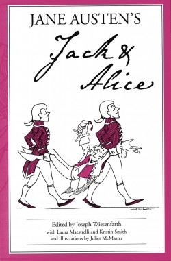
When I illustrate one of Austen’s juvenilia, I look for some dominant theme, to help me seize the moment to be illustrated. Jack & Alice exploits a humorous hiatus between strict formality and the wildly informal: for instance, after the elaborate ritual of the masquerade, the guests are all “carried home, Dead Drunk” (7). I contrasted the stiff formality of the footmen in livery, who do the carrying, with the wild dishabille of Jack Johnson, who is still drinking and disheveled, his bellybutton exposed for all to see!
Lesley Castle is rich in opportunity for the illustrator. Peter Sabor sponsored that volume, edited by Jan Fergus, for the AGM he convened in Quebec City in 1998. Since that AGM was on Northanger Abbey, we had our cue to give full emphasis to the gothic. Move over, Castle of Otranto. Here comes Lesley Castle!—an “‘old and Mouldering Castle . . . on a bold projecting Rock’” (Lesley Castle 3).
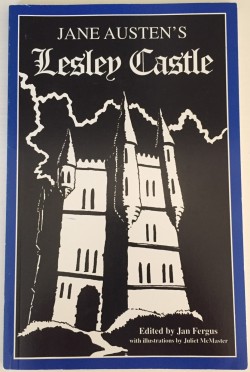
For the title on the cover we used gothic script, and I showed the Castle with dramatic lighting during a lightning storm. To emphasize the Scottish location, I also depicted the Castle in daytime, with a shepherd playing the bagpipes in full Scottish fig. Craigievar Castle in Scotland provided a real-life model.
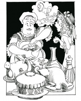
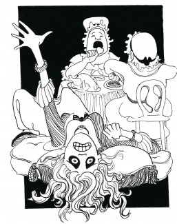
For a theme to exploit, I enjoyed the extreme contrast between the Lutterell sisters, Charlotte and Eloisa: a parody in advance, you might say, of Sense and Sensibility. Charlotte is the down-to-earth sensible sister, committed to cooking and practicality; Eloisa is Sensibility Squared, tearful and handwringing. For the contrast I chose an early scene: Charlotte is busy cooking for the wedding feast next day when the distraught Eloisa reports the fatal riding accident of her fiancé. “‘Good God!’” is Charlotte’s response. “‘[Y]ou don’t say so? why what in the name of Heaven will become of all the Victuals?’” (8). I carried on the contrast in the next picture, which shows Charlotte and her mother stolidly eating their way through the wedding baked meats, while Eloisa succumbs to “‘dreadful Convulsions’” (9). (Now, where in the novels could you find a useful phenomenon like “dreadful Convulsions”? Marianne’s “putrid tendency” [SS 307] pales in comparison!)
 |
 |
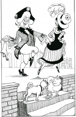
For more Scottish reference I followed the Lesley brother to Paris, where he goes to salve a broken heart. I got Notre Dame in the background (no Eiffel Tower yet). And just as my Scotsman finds consolation in Paris, so I imagined a Parisian lady succumbing to curiosity about just what a Scotsman wears under his kilt. (That bit, I confess, is not in Austen, but illustrators are sometimes allowed to make their own contributions.)
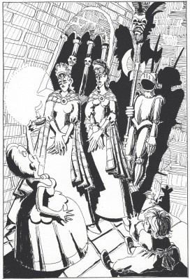
Another contrast—this time between two pictures rather than within one: frivolous Sir George Lesley pursues the pleasures of London and a randy dog in the foreground does the same (a trick I steal from Hogarth); at the other end of the kingdom his new wife first meets her stepdaughters in their remote castle. They meet by candlelight, you see, so I can employ chiaroscuro, like Caravaggio and Rembrandt, no less! She calls them “‘two great, tall, out of the way over-grown, Girls, . . . Scotch Giants’” (22). They call her “‘an insignificant Dwarf’” (20). The little Lesley niece is there, and to avoid sentiment I depict her as mischievous and brattish, sticking out her tongue and making a rude gesture. And please don’t miss the mouse with its grotesquely enlarged shadow!
 |
 |
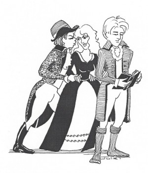
The Three Sisters provides a lot more information about what the characters want than about what they actually have. That is, much of the action is in the mind, rather than external and physical. (But why should I let that deter me?) Mary Stanhope, the principal letter-writer, wants a rich husband—well, she would actually prefer to get the riches without the husband, if possible. She presents a long list of what she expects after her marriage.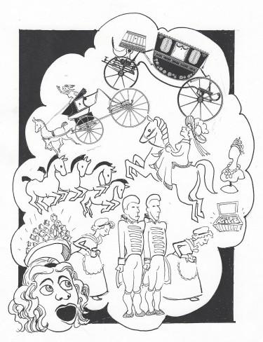
“I am to have a new Carriage hung as high as the Duttons’. . . . You must set up your Phaeton. . . . You must buy 4 of the finest Bays in the Kingdom & . . . hire two more Footmen to attend me.” (The Three Sisters 13).
But all this, you might say, is pie in the sky and not realized. So I put it in her speech balloon. Likewise the odious Mr. Watts, her rich suitor, mentally debates which of the three sisters he might marry. He envisages them as dummies in a shop window. So he too gets a kind of “thinks” balloon—only since he’s a male, I give him a manly squared-off version.
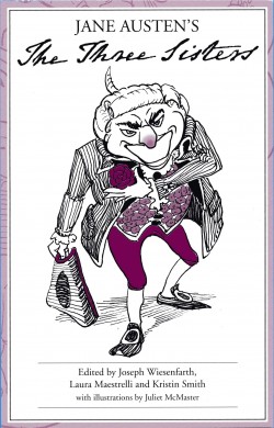
Jane Austen is good at the unwanted suitor. Think of poor Lizzy Bennet stuck with Mr. Collins as a dance partner or Fanny having Henry Crawford foisted on her. Mr. Watts is plain, we hear: “‘so plain,’” says Mary “‘that I cannot bear to look at him’” (2). And yet if she wants what his money can buy, she has to take him with it. When things are more or less settled between them, he pays a call, in due form, telling her, “‘So, Miss Stanhope . . . you see I am come a courting in a true Lover like Manner’” (22). I imagined him dressed to kill, with a rose in his buttonhole. And we used that image for our cover design of The Three Sisters. (With The Beautifull Cassandra, my magnum opus, I had the luxury of color. Alas, that was something the Juvenilia Press couldn’t afford—until recently, that is. But sometimes for the cover design I was able to add a single color to black. At my request, for The Three Sisters, our designer reddened the nose.) This Mr. Watts is intended to give you the creeps.
As Austen matured, it seems, she supplied less rowdy behavior and less information about appearances. Lady Susan comes relatively late among the early works. I was glad when Christine Alexander invited me to do the illustrations for her edition of Lady Susan, commissioned for JASNA’s 2005 AGM to complement its theme of Letters in Fact and Fiction. That text is long for the Press’s usual volume size, so illustrations had to be sparse: a lot of ground to cover in few pictures. But we certainly have strongly marked characters. Each of them, I realized, has divided desires and commitments, so as my model I took a recurring motif of choice between opposites: for instance, Reynolds’s famous portrait of Garrick claimed by Comedy on one side, Tragedy on the other. Lady Susan herself, for instance, wants Reginald for status and security, but her lover Manwaring for sex. Her friend Alicia’s loyalties are divided between Lady Susan and her gouty husband. So my drawings were not of actual scenes, but mini-allegories illustrating the conflict of desires in each character. That was my way of covering the ground.
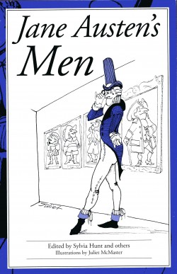
As the Juvenilia Press snapped up and edited one notable item of Austen’s juvenilia after another, we began, alas, to run short. A collection of brief items we called Jane Austen’s Men included some wildly improbable narratives. The sexually insatiable Sir William Mountague allowed me some enjoyable flights of fancy. The story begins with a list of his forebears, so I showed Sir William in his family portrait gallery. I hope you recognize the period dress: Elizabethan, Cavalier, etc. I gave Sir William a large nose (we know what that represents!)—and all his forebears likewise have that distinctive proboscis.
The action in this brief tale moves fast, so I had to too. For instance:
Sir William soon fell in love. [Not for the first time!] But Miss Arundel was cruel; she preferred a Mr Stanhope: Sir William shot Mr Stanhope; the lady had then no reason to refuse him; she accepted him. (Jane Austen’s Men 7)
You might call that unseemly haste. So I showed Miss Arundel actually leaping over the corpse of her lover to Sir William, whose pistol is still smoking.
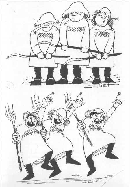
There are some zany moments in Jane Austen’s brief dramas too. The dramatis personae of The first Act of a Comedy lists “Chorus of Ploughboys”—not the typical personnel of Austen’s compositions. We hear no more of these ploughboys until, suddenly, they join lustily in a song. I produced two pictures, from dozy to manic, when I imagine them clumping a wild rustic ballet (Three Mini-Dramas 19, 22).
![]()
What was left of the juvenilia for the 2020 AGM’s long-delayed celebration of these brilliant early writings? Our Cleveland conveners, Jennifer Weinbrecht and Amy Patterson, were willing to sponsor a new Juvenilia Press edition, to be launched at the Cleveland AGM, edited by me and others and illustrated by me! I am long in the tooth now and sight-impaired, but I wasn’t about to pass up the opportunity. Two brief and witty pieces from when Jane was only eleven, Edgar and Emma and Amelia Webster, were still available, and with Adela Burke and Aaron Mazo of the University of Alberta I launched into editing them. Moreover, Christine Alexander, the Press’s director, declared that this time I could use color!
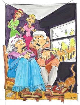
Edgar and Emma is a minimalist satire of the novel of sensibility, with all its sighs and raptures, but with a notable quotient of nonsense thrown in: a family with innumerable offspring, a pair of parents who spend years in lodgings by mistake. Here are Sir Godfrey and Lady Marlow, cooped up in meagre accommodation when they might be taking their ease at one of their commodious estates—while their daughters roll their eyes at the vagaries of their parents.
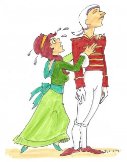
Emma is irreversibly in love with Edgar, who never appears. Desperate for a confidante, she turns to the footman, but Thomas knows better than to make himself available for the purpose and rejects her emotional unloading. You may recognize an allusion here. I deliberately recalled Tenniel’s illustration to Humpty Dumpty’s poem in Through the Looking Glass: “But he was very stiff and proud: / He said, “You needn’t shout so loud!” (Carroll 167–68).
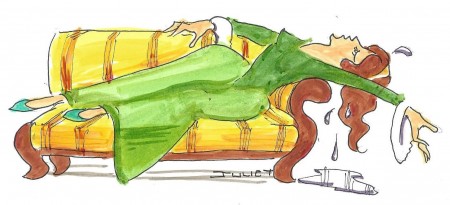
Sensibility must have its outlet, however, and Emma interrupts a formal visit—another explosion of the deviant into decorous social ritual—by grabbing the bell-pull to demand the whereabouts of Edgar. (I could pack in only a fraction of the plethora of children in the Willmot family.) But Edgar is not available. Poor Emma naturally has to spend the rest of her life in the approved sentimental manner—in tears. I wanted to emphasize the self-dramatizing element in Sensibility. Emma’s final succumbing to the pangs of despised love might have been choreographed.
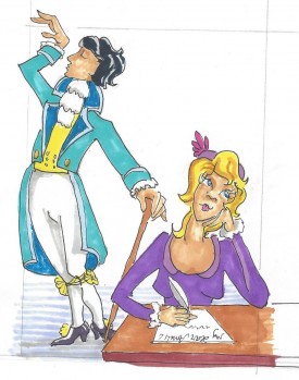
Amelia Webster, a succinct satire on the epistolary convention, is all about matchmaking as practiced by siblings. Sisters barter their brothers to their friends, brothers their sisters. The brothers use money as persuasion: “‘She will have two thousand Pounds & as much more as you can get’” (15). The sisters bribe with beauty: “‘[M]y amiable Brother . . . arrived on thursday, & never did I see a finer form,’” Amelia’s friend writes to her (14). I imagine the brother conniving at this matchmaking process and striking an irresistible pose as she writes her letter. Amelia takes the hint: though it seems that she has never met this handsome George, she duly parades in front of his house.
Jane Austen enjoyed taking off the love-at-first-sight convention. In Shakespeare’s comedies there is a lot about “love, first learned in a lady’s eyes” and the almost electrical current that an exchange of looks can effect: “‘no sooner did I first behold him,’” Laura of Love and Freindship writes conventionally, “‘than I felt that on him the happiness or Misery of my future Life must depend’” (5). “‘Is it a first Love?’” Lady Williams tenderly asks Alice of Jack & Alice and helpfully advises, “‘Preserve yourself from a first Love & and you need not fear a second’” (10). But in Amelia Webster Jane Austen outdoes all sallies. After Amelia walks by, George writes, “‘I saw you lovely Fair one . . . thro’ a telescope, & was . . . struck by your Charms’” (17). Next thing we hear, they’re married! Here we have love at first telescope-sighting! In representing this striking moment, I exploited a movie convention: when a commander at sea—say, Nelson at Trafalgar—looks through a telescope, we viewers get an inset of what he sees. In my picture the conniving Amelia gives George what I call the “come-hither wink.” Instead of the usual circle, my inset is heartshaped. Call it a special extra gift from illustrator to reader!
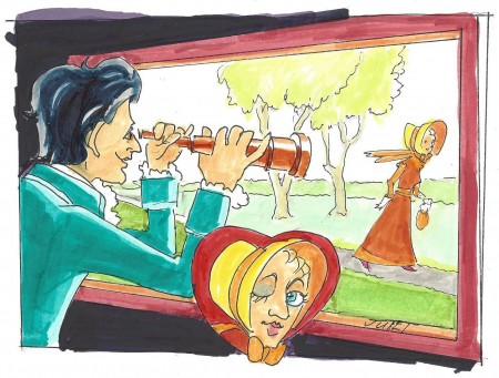
After the rowdy over-the-top narratives of the juvenilia, with their violent physicality, cheerful overstatement, and in-your-face descriptions, the novels are—mercifully, perhaps!—quiet and understated. And the famous restraint of the mature Austen, the nuance and suggestiveness, give us much to be grateful for. The restraint applies to visual appearances of the personnel too: no greazy tresses, swelling backs, red faces, or Scotch Giants. Jane grew up; and she turned from overstatement to subtlety in the matter of physical appearances as well as in so much else.
We know that appearance still matters. Beauty, or the lack of it, remains a major factor in marriageability, and these are courtship novels. But I think Austen was schooling herself in the principle that it shouldn’t matter too much. I like to think of Northanger Abbey as something of a turning point. Vacuous Mrs. Allen’s obsession with her gowns and Isabella’s fixation on new fashions in headgear signal the author’s shift of interest from dress and appearance to matters more essential. “Dress is at all times a frivolous distinction” (NA 73), declares the narrator authoritatively (though ironically too, no doubt). And though Austen continues to discuss her own caps and millinery decorations in her letters to Cassandra, in the novels it is the frivolous characters like Lydia Bennet who make a big deal of them. No more falling in love with bonnets, as in The Beautifull Cassandra! Likewise the slapstick of colliding bodies is left behind.
No doubt it is all to the good; we like the novels as they are. But I’m glad we also get to read young Jane before she tamed her restive muse, when appearances were in your face and bodies to the fore. Thank you, young Jane, for your unashamed physicality and the vigorous visibility of your characters, which have given me my opportunity. Here’s my toast to the teenage author celebrated at the virtual AGM: “Here’s looking at you, kid!”
NOTES
1Millais illustrated Trollope’s Orley Farm (1862), Phineas Finn (1869), and Phineas Redux (1874), which were serially published; Leighton illustrated Eliot’s Romola (1862–1863), which ran in the prestigious Cornhill Magazine.
2To avoid weighing the essay down with double references, my page numbers refer to the Juvenilia Press editions of Austen’s juvenilia, where my illustrations appear.
3Stop Press: I'm happy to report that the Juvenilia Press has just undertaken to reprint my Beautifull Cassandra.
4An early volume from the Juvenilia Press was Austen’s Love and Freindship, which I edited with several students. One of them, Sherry Klein, volunteered to illustrate it, so I stepped aside. This volume, reprinted several times, was the first designed by Winston Pei of Black Riders Design, who gave us our “look” and has remained our principal designer. He was originally a student in the course on Jane Austen that produced this edition.
